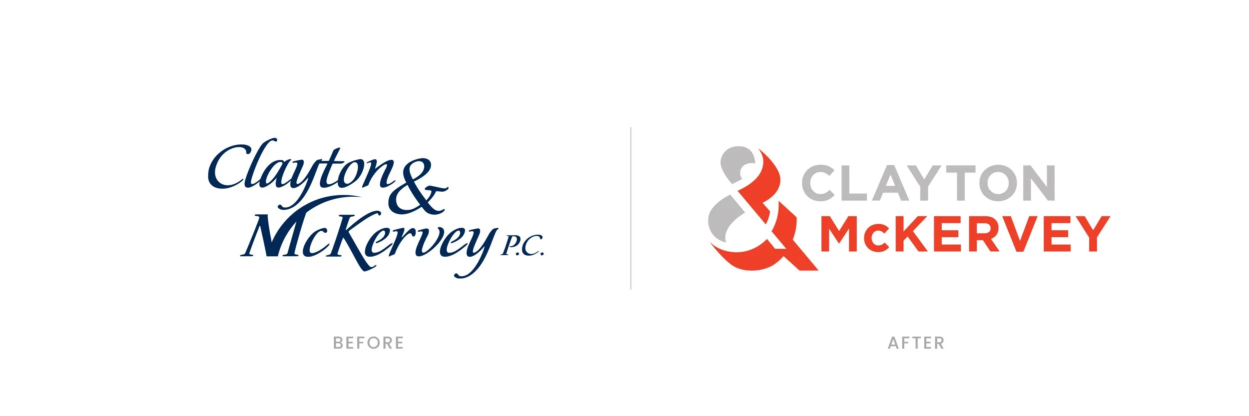
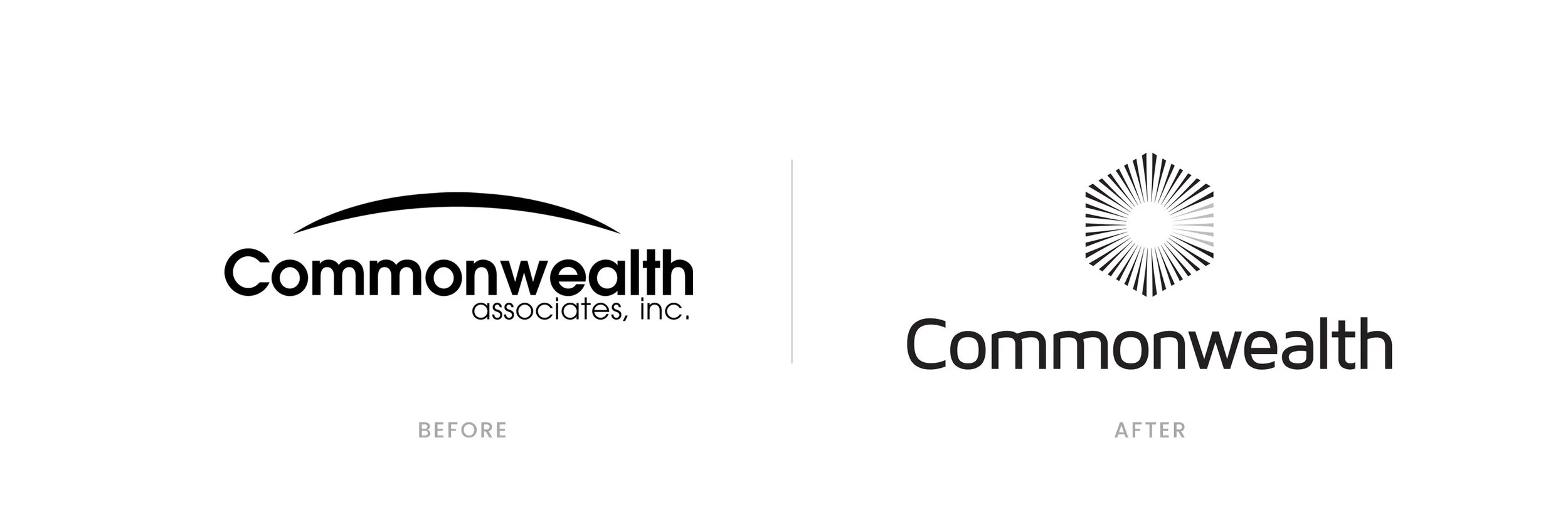
Logo design

It’s more than a pretty typeface. Distilling a brand’s essence into a logo takes a lot of hard work. With each logo we design, dozens of alternatives are presented following a significant discovery and research process in which the category and competitive set are audited. The results are worth the effort. And critical to any branding or rebranding campaign.

Comparison of two logos for Amerisure Insurance, with the older logo labeled 'BEFORE' on the left and the updated logo labeled 'AFTER' on the right. The logo features a stylized red, white, and blue American flag motif, with bold blue text.
Comparison of two logos: on the left, the AxleTech International logo in blue text, and on the right, a new AxleTech logo in green and dark gray text, labeled 'before' and 'after'.
Comparison of two logos for Clayton & McKervey, with 'Before' showing a cursive blue font logo and 'After' showing a modern gray and red logo with an ampersand and the company name.
Comparison of two logos for Eagle Ottawa, showing a change from a detailed eagle with a shield and feathers to a simplified stylized eagle head, with text 'Eagle Ottawa' and 'Automotive Leather'.
Comparison of two automotive company logos, 'Delphi' on the left and 'Nexteer Automotive' on the right, labeled as before and after.
Comparison of two Plex logos with the words 'BEFORE' and 'AFTER' beneath each, showing a redesign of the logo.
Comparison of two logos with the words 'BEFORE' and 'AFTER' beneath them. The first logo is black with stylized text reading 'TERRES' and the second logo features a blue and white globe with the word 'TERNES' in blue.
Comparison of two logos, one labeled 'Before' showing a traditional blue square logo with a floral emblem and the text 'Bank of Ann Arbor,' and one labeled 'After' showing a modern blue rounded rectangle logo with the text 'bank of ann arbor' in lowercase, white font.
Comparison of two logo designs for Commonwealth Associates, Inc. with the word 'Before' under the left logo showing a simple arc over the word 'Commonwealth,' and the word 'After' under the right logo featuring a hexagonal icon made of radiating lines above the word 'Commonwealth.'
Comparison of two logos for Corner Dental, with the tagline "Healthier teeth. Happier you."; the left logo in black and white, labeled 'Before', and the right logo in blue, labeled 'After'.
Comparison of two ESPRESSO ROYALE logos; before and after redesign. The before logo is round with a black coffee cup emitting steam, surrounded by a yellow border with the text 'ESPRESSO ROYALE'. The after logo is also round, featuring a stylized face with a white hat, mustache, and sunglasses, with a blue and red background and the text 'ESPRESSO ROYALE' and 'EST. 1987'.
Comparison of two logos for HDT Automotive, with the before logo on the left showing black and gray text and red speed lines, and the after logo on the right featuring bold red outlined text with gray "AUTOMOTIVE" below.
Comparison of two logos, both featuring a colorful hand. The first logo on the left has a hand with red, green, yellow, and blue segments, with the text 'POEM DESIGN TECH' next to it. The second logo on the right shows a hand with overlapping sections in red, green, blue, orange, and yellow, with the text 'poem DESIGN CO.' next to it.

We also design logos from scratch.

Whether it’s starting up a new company or launching a new product, we love working from a blank page. To create a new logo, we use the same process of research, discovery and hard work. The finished logo will capture your brand’s core and be a versatile system that works across all types of mediums, for years to come. When further enhanced by color palette, typography, and other design elements, your brand will truly come to life.

United Nations logo with blue circle and white and black text
Sonic Lunch logo design
Michigan Opportunity Zones logo featuring a blue square with 'MI' and 'Z', a globe with Michigan's outline, and text 'MICHIGAN OPPORTUNITY ZONES'.
Logo for Dealership sales platform, featuring the word 'DEALERSHOP' with a stylized red check mark integrated into the letter 'A'.
FUEL logo with red background, black and white circular border, words "PERFORMANCE" at top and "LEADERSHIP" at bottom.
Logo of Panhadle First Bank with colorful geometric icon and bold black text.
Stylized logo of the word Herbana with decorative swirls.
Logo for Perkins Construction Co. featuring a stylized house with a brown roof, yellow and blue walls, and a banner with the company's name, established in 1984.
The word 'VROUIT' in bold, stylized green and black text with a white background.
  • “Not only is our campaign the most talked about in our area, it helped fuel our growth and perfectly aligns with our mission to help our customers and community.”

    - Tim Marshall, President, Bank of Ann Arbor

Ready to roll?

Got questions? Want to chat without a sales pitch? Complete this form or email Ernie Perich directly at periche@perich.com.